Tuesday, December 28, 2010

Book Review: "Art Revolution" by Lisa L. Cyr


4.5 out of 5 Stars

I actually read Art Revolution at the end of the summer and have been so busy I hadn't gotten around to writing a book review yet. This book was very influential for me.

The "art revolution" Lisa Cyr is referring to in her book is that of mixed media artwork. I work primarily in alternative photography, but after reading this book, it inspired me to learn as many art mediums as possible. Not only was I inspired, but it motivated me enough to sign up for a watercolor and an oil painting class at school last semester. I loved learning and exploring these new mediums so much I signed up for 3 painting classes and a drawing class for this semester. In my opinion, a book that can inspire real, concrete change is a powerful book. This book really amplified my desire to learn as much art as I can (however, individual results may vary).

Art Revolution is packed full of beautiful and inspiring images. It was a feast for the eyes and the mind. Cyr picked very thoughtful, talented artists to feature in her book. She interviewed 20 mixed media artists, including a 2 to 3 page article about their art work which was packed full of great quotes from the artist. Each section also has a few images to show off the artist's work. Some of the artists even give step by step demos on how they created a piece of art. The directions in the demo seemed a little unclear sometimes, but it gives you a good general idea of how mixed media works and of different techniques you can try in your own work.

What I gained most from this book (well . . .besides the desire to act) was reading about the artist's working process. It is fascinating for me to hear other artists talk about their work. It helps me understand my own processes and concepts better, and also helps me develop skills in talking about my work. I also gained a lot of insight about working with concepts and how to illustrate ideas. Mixed media is not always easy to pull off, but in Art Revolution there are many great examples of beautiful mixed media art, as well as explanations about why artists' are working with mixed media. I think if you are a mixed media artist, you will enjoy this book.

Sunday, December 26, 2010

Book Review: "COLOR: messages and meanings" by Leatrice Eiseman

A must have:


5 out of 5 Stars

This book is a great resource for all artists, but especially for graphic designers, interior designers, and commercial photographers. This book is an essential resource (it is targeted to this audience . . . especially graphic designers). I am not a graphic designer, but if I was, I know I would be referencing this book daily for inspiration and direction. I have read a couple books on color (color theory, color symbolism) and this is the best book I have read. The author, Leatrice Eiseman, has strong credentials and it shows in her book. She knows what she is talking about. The book is easy and enjoyable to read and very informative.

It starts by covering the basic colors (red, blue, brown, purple, orange, etc.) and the symbols/moods associated with those colors. She even touches on how colors effect us psychologically. At the end of a color section she lists different shades of that color along with positive and sometimes negative adjectives/symbols often associated with these colors. I found this section the most interesting. It was very informative and comprehensive. It is a very helpful reference for any artist who works in color to better understand what role color plays in sharing a message with their audience.

The next section is about color in the marketplace. This section is more about using color in the advertisement world. She focuses on creating an identity for a company and how color effects their image and reflects their mission as a company. Eiseman talks about using color as an attention grabber and using appropriate colors to fit certian ages, genders, and shopping patterns.

The next section goes into color relationships. She has a brief section about color schemes on the color wheel and the messages sent by using those schemes. Following this, she gives 20 different moods (exotic, sentimental, unique, restful, assertive, nightlife, etc.) with a brief description of the mood and associated colors. Then, on the next page, there are 20 colored squares giving examples of a dominant, subordinate, and accent color combinations that could be used to convey that mood. The part I found most impressive is at the end of the book where she has a chart of every color she used in the book and the CMYK numbers for that color! This chart is a great time saver and will help you get the exact color combination desired. It makes this book a very practical reference book.

In the last section, she covers color trends in the advertisement world and how to spot them. She briefly discusses trends in fashion, graphic design, technology, and art. She even gives specific examples of places to look.

I really loved this book. Not only are the images beautiful and pleasurable to look at, but it is packed full of information. It is the best book on color I have seen or read. I STRONGLY recommend it to anyone who works with or is interested in color theory, color relationships, or color symbolism. If you are a graphic designer, this book is a must have. It is worth every dollar spent on it!

Wednesday, November 10, 2010

Art Show

I am having an art show! The opening is Friday. This is my first solo show and I am very excited about it. I have been working on my concept and art pieces for a year and now it is finally time to share what I have done. After my show is finished I am planning on posting all the images from it on my blog.

Saturday, October 23, 2010

Holga Camera - Cross Processed Film


I took these images with a toy camera called a Holga. It is a cheap, plastic medium format film camera. Because it is so cheap it leaks light in, vignetting the edges of the image. I crossed processed the film when I got it developed and so it shifted all the colors around.

Saturday, September 18, 2010

Liberated


Last Spring when I made this project, I felt things were amiss in my life. I felt I was living a very lopsided life and wasn't practicing the self control and discipline I felt I needed to. I thought about that a lot, and I noticed the other people around me, and thought about our society as a whole and could see they were in a very similar predicament. I decided this was a little concerning and I need to say something about it. So this project was born. It is about the importance of staying balanced and grounded in life. This self control ultimately allows more freedom in the end.

I showed this piece at the end of last spring semester at my school. I hung it in the halls of the art building. I had a beautiful, long branch I hung my prints from. I wanted to emphasis the importance of a branch in a birds life. Sadly, the photo I have of the final presentation isn't as lovely as I would have hoped. The lighting in the building was terrible and it was hanging in a hall, so I didn't have enough room to back up to get the whole thing. But you can see the general overall idea. It took a long time to hang, but it was well worth it!

I printed the images on watercolor paper with the historic cyanotype printing processes.

Saturday, August 21, 2010

Gum Bichromate - Ballerina


I think ballerinas are such a wonderful symbol for grace, dignity, and discipline. I love how they move. One of my dear friends is a ballerina. She is one of my favorite subject matters to photograph. I printed these Gum Bichromate pictures as a birthday present for her, and as a thank you for all the hours she has spent with me over the last couple of years modeling in the studio. I picked a soft, silvery color for my paint as a representation of the way I view ballerinas: gentle, subtle and eloquent.

Monday, August 9, 2010

Image Transfers on Wood


I made this book for a friend of mine who works at the university I attend. He had made some comments earlier that got me thinking about how he could use a nice gift in his life lately. So with the help of my teacher we were able to borrow his well-beloved cowboy outfit and photograph it.
I photographed these images with a 4x5 large format camera. It was the first time I had ever used one before. My teacher let me use hers and went out photographing with me so she could teach me how to use it (I loved it so much a couple weeks later I bought my own ;).
Besides learning how to use a 4x5 camera, I was also interested in learning some new book binding techniques. I decided I was going to make my friend a handmade book with the images I took. I choose wood as the substrate because I wanted to play with new materials and I thought it fit the cowboy theme. I scanned the images on the computer,printed them off and transferred them onto wood. I stitched it with a green thread and have a belt around it to seal it closed.

Wednesday, August 4, 2010

Photographic Toning with Kool-Aid


I wanted to experiment with homemade photographic toners, so I bought a package of red and blue kool-aid. I mixed each package with a little bit of water. I then transferred some laser prints onto a heavier paper. I placed the images (or sometimes just sections of the images) in the two separate colors for about 30 seconds. I am happy with how it turned out. I am planning on making a toning journal where I have a collection of different types of papers with different types of toners as a reference for future projects. I think toning an image can add a lot to a print.

Thursday, July 29, 2010

Book Review: "Photographic Possiblities" by Robert Hirsch

An excellent book I just finished reading:


5 out of 5 Stars


This book is fantastic! It is laid out in textbook format, but don't let that intimidate you. It is well worth reading!
The first note to make about this book is that its focus is more directed towards photographers working with film. This book covers topics such as: paper and negative developers, photographic toners, specialty films and cameras, and how to mix and store chemistry. It also has an excellent opening chapter about what photography is and pushing the boundaries of art making.
The author, Robert Hirsch, also wrote a lengthy chapter about historic processes. This chapter was the main reason I bought the book. I picked up quite a few helpful tips for coating paper and what substrates work with different processes. I felt the information was adequate enough to at least begin experimenting with these processes, though I sometimes wished he'd gone into more depth. I learned about a new process called gumoil that I am very excited to try and already have a project in mind for it.
Overall I found this book to be very informative. Hirsch is very thorough in the information given. He lists recipes for: making toners, chemistry for historic processes, as well as film and paper developers. He explains in detail what the different chemicals do and why they are needed. He tells what the different visual results will be depending on what type of developer is used. (For example, with film he specifies how each developer will effect the grain size, contrast, etc). He also gives a lot of resources, such as: introducing a wide range of working artists, websites to buy supplies and chemicals, websites for more information about the topic, and a long list of resource guides at the end of each chapter, including other books.
One of the things I liked the best is that this book is filled with beautiful photographs from a wide range of artists. Often he would use the photographs as examples of what he was talking about by using artists who used a certian processes or developer or technique. Also the images would have quotes from the artists that not only explained their technique but also talked about what their art means or why they made it. I love that! It was kind of like little artists statements with each photograph.
The one thing I found most disappointing was the description of how to make digital negatives. I felt like he really skimmed over the concept. He did not give much detail about it. He mentioned the need to change the curves in Photoshop and what to change it to depends on the process you are working with. But then he gave no information about what the curve settings need to be. All he did was reference an artist's website, Dan Burkholder, who has written a book about making digital negatives. So, I guess if you don't already have the curves and information you need, you might want to look into buying the other book, too. Maybe he felt like it was too much information to try and add to his book. But I did take note that for someone who doesn't have experience with making digital negatives, they will probably get lost when making one if they are only going off the information he provided.
My final critique of the overall quality, clarity, information, and inspiration of this book is that it is excellently executed. I felt very inspired by it. I wrote a long lists of ideas to try that I gained from reading this book. I was really influenced by the artists' works and writings. I felt like I gained a lot of insight into the art making process. I learned things about photography I did not know, especially new darkroom techniques. This book is a resource I plan on referring to often. I recommend it to any serious artists working with film, darkroom techniques, or historic processes. To me, it is a must have!

Tuesday, July 27, 2010

Experimenting With Plexiglass


This is an image of my husband, Devon Harbaugh. I was working on two projects when I made this piece. The first project, I was trying to figure out a good way to convey the concept of layers building upon itself. With the other project, I was playing with the idea of making a book out of plexiglass. I wanted it so that you could look through all the pages and see a final image, but that you could also flip through the pages as you would a book.
When all the pages were put together, I loved how it looked, but each individual piece was not strong enough to hold interests as you looked at them by themselves. I still need to explore that concept with a different approach and subject matter.
As far as the other project goes with building up layers, it wasn't quite the right look I was going for. I think this project looks more broken and pieced back together than individual layers built up to make a whole. I found a different way to resolve my layers piece, much different than how this turned out. But I think this approach has great potential for future concepts and projects. What is your critique and feeling about this picture?

Wednesday, July 21, 2010

Book Review: "Encaustic Workshop" by Patricia Baldwin Seggebruch

Another book i just finished reading:


3.5 out of 5 Stars


I read this book because I am interested in mixed media techniques and have played some with wax and wanted to learn more. This book covers some basic techniques and ideas for working with beeswax as an artistic medium. I wouldn't suggest this book for someone who is seriously interested in learning the traditional techniques of encaustic painting. In terms of how to paint with encaustic, the information was limited. But if you are a mixed media artists or are always looking for new techniques this is a fabulous resource to have in your library.

Patricia takes a very alternative approach using beeswax as a form of art. This book explores carving the wax, adding watercolor, transferring images, adding found objects, cloth and papers, and even burning shellac on the wax. She even has a chapter at the end with tips, examples, and ideas for how to present or frame your encaustic work.

The step by step images for all her technique examples seemed clear and easy to follow. However, I didn't care much for the examples of the finished art that were given throughout the book. Most of them I found to be uninspiring and as far as I could tell there was no real concept to any of her work, which was a disappointment. She made only a few references to concept throughout the whole book!

She did have some interesting techniques that sparked my interested, though. There was an example she showed where she bleached black paper. It looks like it has a lot of potential to create beautiful things. I am also interested in trying the shellac and watercolor techniques.

Here are the examples of these techniques. I photographed them from the book:

Bleaching Technique


Shellac Technique


Watercolor Technique


And now for my two cents about what I have observed from this book and in my own experience: I have found that when it comes to working with beeswax often times simpler (an image with a few accents and a couple layers of wax) is better...unless you want to go for a more abstract look. When I am trying to use photographs as the main focus and I am adding sand and twigs and paint and text and so on, it just never seems to come out correctly. It usually comes out looking cluttered or disorganized or scrapbooky. I think working with encaustic has a delicate balance between being a cohesive, strong piece of art and being a mess, boring, or having disconnected elements.
But, like I briefly mentioned before, when it comes to abstract work there is a lot of potential. There are many great textures and colors possible through the layering techniques of wax. In general I have found that I like the beauty and mood of abstract work with mixed media encaustic more then something that has a recognizable subject matter. An abstract approach with encaustic can create some very beautiful, visually interesting art.
On a final note, an important tip I discovered: when using photographs make sure the background surface is white, not wood/dark colored because it will darken your natural image a lot as your image becomes partly transparent from the wax.

Tuesday, July 20, 2010

Great Horned Owl


About 4 or 5 days ago very late at night I spotted a Great Horned Owl perched on a telephone pole. It was hard to see it because of how dark it was, but I was very excited about it none-the-less. I love owls and they are one of my favorite birds. Yesterday I went to photograph at the Arboretum in a neighboring town, and right when we got there, around dusk, an owl flew right above my head. I watched where he perched and was able to take some photos of him. Unfortunately the lighting was dim, so I had to bump up my ISO (which causes graininess/fuzziness) and slow my shutter speed down (which causes motion blur). So even though they aren't perfect pictures (and I can't afford a $5,000-$10,000 telephoto, fast, birding lens), I am still happy I was able to get them!

Monday, July 12, 2010

Darkroom Mural Print

Sorry I haven't been posting my art work as much as I should be lately. I have been having great art experiences other than just creating, but I have been creating lots this summer too and I have so much art to post. Sometimes it just takes me a while after I create something to re-photograph it so I can post it. But I took some pictures and will be sharing them here in the next few weeks.


To start with, this is a self portrait I made as part of my BFA show. My BFA show is my senior project that is required for a Bachelors in Fine Art (BFA). I have been working since last December on it and will be showing it this November at Gallery East in Price, Ut. I am really excited about it.
This photograph was taken on a medium format camera called a Hasselblad. The film I used was Ilford Pan 50 which allows for really fine detail and beautiful contrast. I printed it large (30x32 inches) in the darkroom by projecting it onto the wall and then taping mural sized RC variable contrast silver gelatin paper to the wall to make the exposure. This photograph is about knowing you have an important decision to make and confronting your fears about it with confidence. It is about taking the first step towards change.

Sunday, July 11, 2010

Book Review: The Art of Papermaking with Plants by Marie-Jeanne Lorente

And yet another book I have read this summer:


3 out of 5 Stars


The way this book is set up is that there is a chapter in the front of the book discussing supplies and materials needed to create handmade paper. Then it gives instructions on how to make handmade paper. The instructions are basic and easy to follow (of course I think paper making is one of those things that is easier said than done). After the brief introduction on how to make paper, the rest of the book, except for a concluding chapter, has recipes for how to make different types of paper. The concluding chapter features a gallery of working paper-artists and shows the diversity of what contemporary artists are creating with handmade paper. Each artists also has an artist statement and bio.

The recipes in this book are broken up into 4 sections: grasses, trees, edible plants, and non-plant papers. Examples of some of the plants found in this book are: bamboo, wheat, chestnut, elm, artichoke, mushroom, zucchini, and tomatoes. The plants under the edible plants chapter seem to be the easiest to access. Some of the plants aren't even indigenous to America (the book was originally written in French and the author is from France). There are 52 plant recipes.

Recipes include: location for where the plant can be found, when is best to harvest the plant, how to prepare it, how long to cook it for, how much bleach to use, how long to rinse it, the results of the paper (texture, look, etc), and what it can be used for. Some of the paper is so fragile that it can't really be used for anything; it is just to look at.

The thing I did not like about this book was the authors writing style. It was cheesy and random. In the first chapter of the book she gives an introduction about paper-making and the invention of making paper. I found it scattered and uninformative. But when it comes to paper-making she seems to know what she is talking about.

I was interested in this book because I'd like to try printing historic processes on handmade paper. I love the unique look and texture handmade papers offer. Plus, I love using my hands to create. I am not sure how well the emulsion will stick to the paper, but i definitely think it is worth trying. I also want to use handmade papers for image transfers and art books.

Friday, July 9, 2010

Book Review: "Book Art - Handcrafting Artists' Books" by Dorothy Simpson Krause

Here is a review of another book I read this summer:


3.5 out of 5 Stars

This book is focused on the art of book making. Dorothy Simpson Krause seems to be a very experienced book artist. The book is filled with well over a dozen examples of handmade books she has created. With each of these examples she talks about her concept and how and why she did certian things, which is always interesting and helpful for me to hear how other artist work.

Krause covers a lot of ground: altering found/blank books, transferring images and text, book layouts, stitching, and making covers. This is great for an overall introduction to these techniques, but I found that some of the examples and how-to steps weren't as thorough as I would have liked, especially on the stitching section. I wish she had more pictures showing what she is talking about with each step. The pictures are kind of vague. I think if you were a beginner without much experience with bookbinding it might be hard to follow. But if you are familiar with bookbinding and have made a handful of books before, you shouldn't have a problem understanding what is going on and would probably enjoy the book a lot.

Besides the lack of more detailed pictures I found the book comfortable and easy to read. Her writing was conversational and easy to follow.

Overall I enjoyed the book. It had some really helpful tips and creative ideas. It gives a broad introduction to book arts and gives insight to the possibilities available, with great examples. I also found the author to be very sincere and open about her art which is also insightful. My favorite part in the book was an example she gave for gelatin monoprints. She showed how to use gelatin, leaves, and paint to make gorgeous transfers onto book pages. I am really excited to try this technique and can see myself using it often in my own book making projects.

Tuesday, July 6, 2010

Book Review: "Image Transfer Workshop" by Darlene Olivia McElroy and Sandra Duran Wilson

This summer has been a nice vacation for me. I am up in Washington while my husband is doing research at a university here. This has been a great time for me to take a break from school and work, and to be able to do what I want! During this time I have been able to read a lot of books. Because I have been getting so much great reading done, I decided to write up some book reviews. This way I can share these wonderful books I have been finding so many gems in and share it with you!


5 out of 5 Stars

I would definitely recommend this book. It is a very simple to read, straight forward book with a wide variety of techniques to transfer images (35 to be exact). It gives very detailed step by step instructions with each transfer as well as step by step photographs to go with them. It is hard to get lost or confused along the way.

Plus, with each transfer it lists: its limitations (potential issues), the different types of surfaces it works well on (wood, cloth, metal, paper), its archival quality, and the materials you will need. Also, it gives a troubleshooting section with each transfer to help you figure out why your transfer didn't work. I also found it really helpful that at the end of the book they have a list of resources for where you can buy the materials you would need.

They also have a chapter at the end of the book showing how the artists apply these techniques in their own work. For me personally, my style and taste differs from theirs, but these techniques can definitely be utilized to fit my own personal vision and offer great potential to all different styles of art making (photography, book arts, mixed media, painting, fabric arts).

I plan on using a wide range of transfer techniques I learned from this book. I like to use different substrates in my work and so I am really interested in the transfer techniques that can be used on wood, metal, and cloth. There was also a really interesting technique where you use silk tissue to make a transfer that I want to try. Once I get home and have access to all my art supplies I will post an example of an image transfer I make based off a technique I learned in this book.

Monday, June 28, 2010

Cyanotype Photograms


In my last posts I talked a little about photograms. Photograms are made by putting an object (leaves, flowers, strings, toys, cookie cutters, etc) onto a substrate that has been coated with a light sensitive emulsion. The emulsion is then exposed in sunlight and then fixed in photo chemicals. Here are some examples of photograms I did with cyanotype a while ago.

Monday, June 14, 2010

Cloth Cyanotype Book


I am making a small children's book with images of birds. The inspiration for this book comes from the old school Dick and Jane books, with extremely simple text and sentence structure. I printed the images with a historic photographic process called cyanotype. This time I didn't print on watercolor paper though, but on cloth. I really liked using cloth as a substrate. I like the softness of the pages and the texture added to the print. I found it a more appropriate and durable substrate for a children book. I still need to figure out a way to keep the edges from fraying though. Any suggestions of the easiest, cleanliest way to fix my edges? Once I do that, it will be ready for me to stitch up into a book form and it will be done. I enjoyed this project so much I plan on making a few of them to sell.
It was really great using the cloth pages for a book too because it is easier than using watercolor paper. This is because the cloth is already pretreated with the chemistry and I don't have to mix and coat the chemistry on myself. There are two great websites where you can buy these pretreated cyanotype cloth pieces:

http://www.blueprintsonfabric.com

http://www.bluesunprints.com/

The later website even has different colors of cyanotype. If you want a fun, simple art project to do I recommend buying a packages of small squares, a large sheet, a t-shirt, whatever you'd like from this website (if you are into quilting and sewing, this is a fantastic way to get your own distinct pattern to work with. The material is washable). While you are waiting for the cloth to come in the mail, start thinking of some fun shaped objects you would like to use for your art piece. This can be flowers or leaves or maybe something like scissors and paper clips or maybe a paper cuttings you did. Whatever it is, make sure its size is compatible to the size of cloth you ordered. When your cloth gets here, take it out of the package, lay your objects on top of it in direct sunlight. It usually takes maybe 10 to 15 minutes (see instructions that come with purchase). After it has been exposed take it back inside. Give it a water bath for about 5 minutes. Then move it to a second water bath that has a little bit of hydrogen peroxide in it(a capsule or two). It only needs to be in that bath for 15 to 30 seconds. (The hydrogen peroxide in the second bath is optional, but recommended. Using it will give you a deeper, richer blue color in your cyanotypes). Then move it to a final bath and let it rinse for 10 to 20 minutes. Hang or lay to dry. And that is it! You have just created some beautiful art!
I have quite a few upcoming art projects I have been gathering plants for, where I will be making cyanotype photograms. I am very excited to create them! I think plant photograms are very beautiful. For inspiration, enjoyment and a vision of possibilities, yet out this artist (make sure to read the artist statement, it is very well written and gives a wonderful insight to the beauty of creating photograms). Also, check out Anna Atkins work, I highlighted her briefly in the post previous to this one:

James Hajicek and Carol Panora-Smith

I think it is important to support shops like the Blueprints on Fabric store so that they stay open and running. I hope each one of you tries it out. It is a super great activity to do with kids too...at birthday parties, preschool lesson, visit to grandmas, etc. ENJOY!

Thursday, June 10, 2010

New York City and the Many Beautiful Historic Photographs

I went to New York City for the purpose of having an exquisite and rejuvenating art experience. And that is exactly what I got! It was well worth the efforts to get there. I saw some of the most beautiful art from dozens and dozens of the many well known masters of art. It is such a different experience to see these things in person rather than just in an art history textbook.
I would like to highlight some of the amazing, historic photographers whose work I saw at the art museums I went to in New York City (the Guggenheim, Metropolitan and Museum of Modern Art):

Anna Atkins, (1869-1950), Cyanotype Print
Anna Atkins was a botanist/photographer who created the first photographic book ever made, which consisted of photo-grams of plant life using a cyanotype printing process. The book is titled "Photographs of British Algea: Cyanotype Impressions." I had the opportunity to see a sample page from her original book.


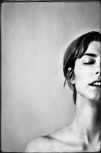
Julia Margaret Cameron, (1815-1879),Venus Chiding Cupid and Removing His Wings, Albumen Print
Julia Margaret Cameron is one of my favorite early photographers. She was very ahead of her time and a great pioneer in creating artistic photography. Her work is well worth looking into; she has some really beautiful creations.


Roger Fenton, Rievaulx Abbey Yorkshire, 1854, Process Unknown
Roger Fenton is an early photographer who is most famous for photographing the Crimean War. He also did a lot of architectural photography. The Metropolitan Museum had a print of his on display. Unfortunately, I do not remember the exact image I saw there because it is one I wasn't familiar with it. But it was a landscape/architectural photograph, instead of one taken from the Crimean War. I like his landscape/architectural images better than his war photographs.


Anne Brigman, (1869-1950), The Wind Harp, Platinum Print


Gertrude Kasebier, (1852-1934), Blessed Art Thou Among Woman, Platinum Print


Imogen Cunningham, 1925, Magnolia Blossom,
Platinum Print

All three of these artist are American Woman who belonged to a group called the Photo-Secession. This was a group of photographers who fought for photography's acceptance as an art form. They approached their art with a more pictorial, soft, moody feel. I really, really enjoy this style of photography both for the philosophy behind the group and also for more dreamlike, emotional feel to the photographs.


Irving Penn, Large Sleeve, 1951, Gelatin Silver Print
Classic, inspirational, talented portrait photographer - known as one of the best! About 12 to 15 or so of Irving Penn's original silver gelatin prints were on display at the MOMA and they are all gorgeous prints.


Henri Cartier-Bresson, Hyeres, France, 1932, Silver Gelatin Print
Henri Cartier-Bresson is known as the "father to modern photojournalism." He is most famous for his photographic philosophy "the decisive moment." The best way I can think of to describe this concept is in Henri Cartier-Bresson own words: "There is nothing in this world that does not have a decisive moment...Photography is simultaneously and instantaneously the recognition of a fact and the rigorous organization of visually perceived forms that express and signify that fact." (Quote cited from Wikipedia).
Currently at the MOMA they have an entire exhibit of Henri Cartier-Bresson's photographs. There is easily over a hundred on display. It was an incredible experience to be able to make it over there and see the exhibit.
My entire art trip to New York City was absolutely amazing and I can't wait to go back! What a wonderful thing that there can be so much beautiful art all in on city.
I have one last artist I want to highlight: William Kentridge. He was actually my favorite part about my entire trip. I liked his show the very best. He isn't even a photographer. He's actually best known for his animated films. He has done a lot with theater and film. He also does printmaking, paper-cutting, and charcoal drawings. Hope you enjoy, unfortunately these small internet images don't even do it close to enough justice...at all! His work is breathe taking in person, but this will give you an idea of his style of work:

Drawing From Stereoscope 1998-99, Charcoal, Pastel, Color Pencil on paper


Title Unknown


Music Box Tondo, 2006, Archival pigment print on Hahnemuhle German etching paper

What I like about William Kentridge's work is the sense of humility that is offers. It is simple, rough, depends greatly on contour lines and has a moody edge to it. He has a large variation in his work, yet it all holds a distinct signature of his style. I can tell that thought, concept and effort were put into each piece. I relate to it on a raw human nature level, if that makes sense? Anyways, I learned a lot about my own art work and got a lot of great ideas from viewing his show. He has a gigantic exhibit going on at the MOMA right now. He filled rooms and rooms all with his own work. That really impressed me.
What are your thoughts and critic on his work, and the other artists I have shared?